Boligplass
Overview
A property is where it is. This shows the where, in three dimensions.
Details
At a glance
- Project type
- Property tool for estate agents
- My role
- Took it from the idea to the working product: what it should answer, how it should look and how it behaves.
- Category
- Web experiences
- Status
- In development2026
What I did
- Framed the product around the question a buyer actually has
- Designed the three ways of looking and the panel that drives them
- Integrated third-party mapping services and Norwegian public geodata
- Built it as something an agent drops into a listing under their own brand
Open boligplass.no(opens in a new tab)Discuss a project like this
Next project
The Dune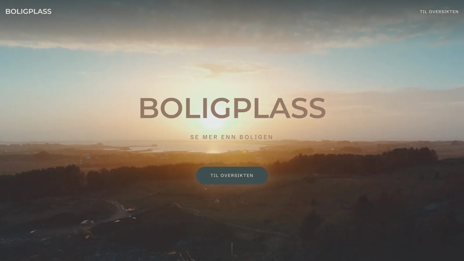
The need
A property listing tells you everything about the inside of a home and almost nothing about where it is. Twenty photographs of rooms, a floor plan, and then a small map with a pin on it.
But the questions that actually decide a purchase are about the outside. How far is the school. Where does the sun come from. What is behind that hedge. Is the block opposite going to stay two storeys. A pin on a flat map answers none of them, and the buyer ends up driving out on a Sunday to find out.
See more than the home
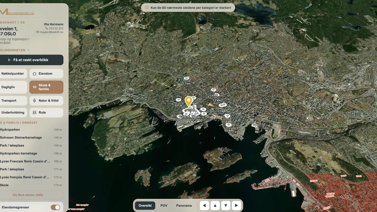
So the product shows the place instead. The address sits in a three-dimensional model of its own city, and you can move around it: an overview from above, a view from the property itself, and a panorama.
Beside it is a panel of the things people ask about: daily life, schools and family, transport, nature and recreation, entertainment. Each one lists what is nearby with the distance to it. Property boundaries can be laid over the ground. The whole thing carries an agent's own branding, because it belongs inside their listing rather than beside it.
Decision
Say where every number came from, and what it is not
- Context
- The moment a tool prints a distance to a school or draws a line around a property, somebody may treat it as fact. Property boundaries in particular look exactly like legal information, and they are not.
- What I decided
- Every data source is named on screen, and the limits are stated in the same place as the numbers: distances are approximate, boundaries are indicative and are not legal documentation. Only the nearest results in each category are marked, and the product says so rather than quietly capping the list.
- Trade-off
- It puts a paragraph of qualification on a page built to impress. That paragraph is what makes the rest of it usable by an estate agent, who cannot put a number in front of a buyer that they would have to take back.
Three ways of looking
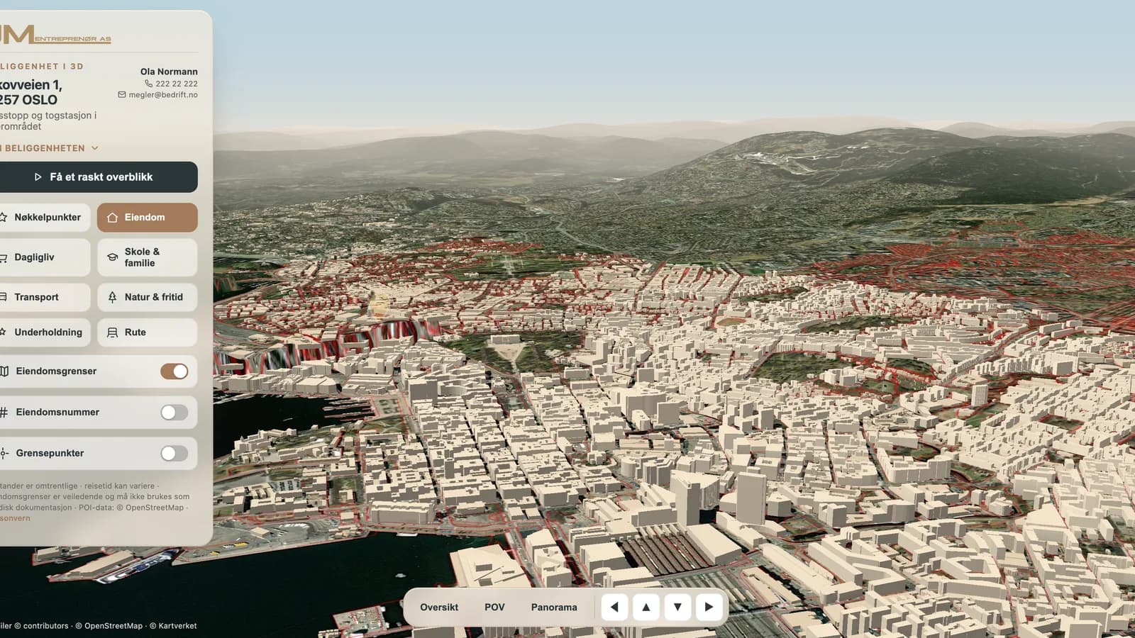
The overview is for orientation: where this sits in the city, and how far the things around it really are. The view from the property is for the feeling of the street. The panorama is for the horizon, what you would see if you turned around on the doorstep.
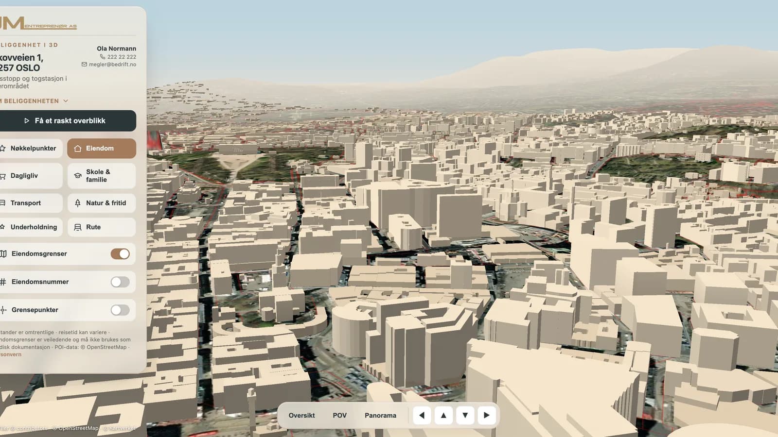
There is also a plainer view where the city is white massing and nothing else. Stripping the surfaces away is what makes the shape of a neighbourhood readable: how tall the buildings are, where the gaps run, what is between the address and the water.
Where it stands
The product works end to end on real addresses, in three dimensions, with real boundary data and real distances.
It is in development rather than sold. What the work settled was the framing: this is not a nicer map. It is the half of a listing that has always been missing, and the thing that makes it credible is that every number on it can be traced back to where it came from.